Dashing
takes 0 minutes to read
Using multiple nice interface dashboards to get an overview of your services is a great thing. But navigating to them all separately could sometimes be rather pain full.
Therefore I looked for some central place to give a broad overview of all of them. During last year many passed through during my search on the internet. The 2 most interesting ones where team dashboard and dashing.
Team dashboard is a promising one which could gather extremely specific data and give those back in some nice graphics. That way you could create your own very specific dashboard with all graphics and measurements in the same theme/layout on one central page.
But I was looking for something more simpler and that's what I found with dashing. By using some custom jobs and views I gathered data from icinga, jenkins, foreman & bacula.
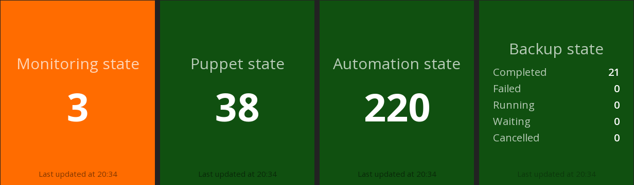

As you can see the square's are showing the total amount of checks from the different dashboard services, if there is one check failing the square of the service will change to a red blinking background. If everything is alright (as it should be) the square is green.
To achieve this I have implemented some checks I found on the internet and wrote some myself:
First row
The first three are using the simplemon widget available in the dashing-scripts repo from roidelaplui
Second row
For the tomtom check the api explorer and lat-lon coordinates which can be a real help to configure this check.
It's also real easy to configure a raspberry pi which you can connect to a screen using hdmi. Therefore I suggest screenly which can iterate through a list of assets like web pages (your custom dashing screen ;), images and videos.
That way you could afford a cheap and brilliant monitor screen!
Keep an eye on it ;)